Hulu Core App Redesign
Turning browsing frustration into content discovery for millions of viewers
I led the end-to-end redesign of Hulu's core navigation, information architecture, and content discovery experience across TV, mobile, and web, while building a flexible, accessible modular design system to ship it all at once.
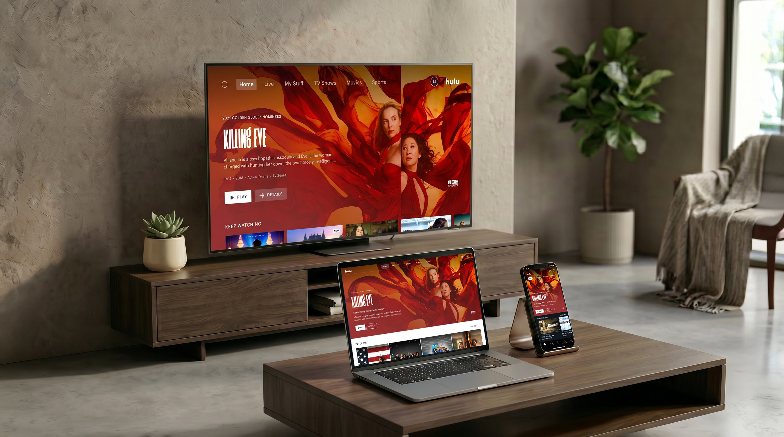
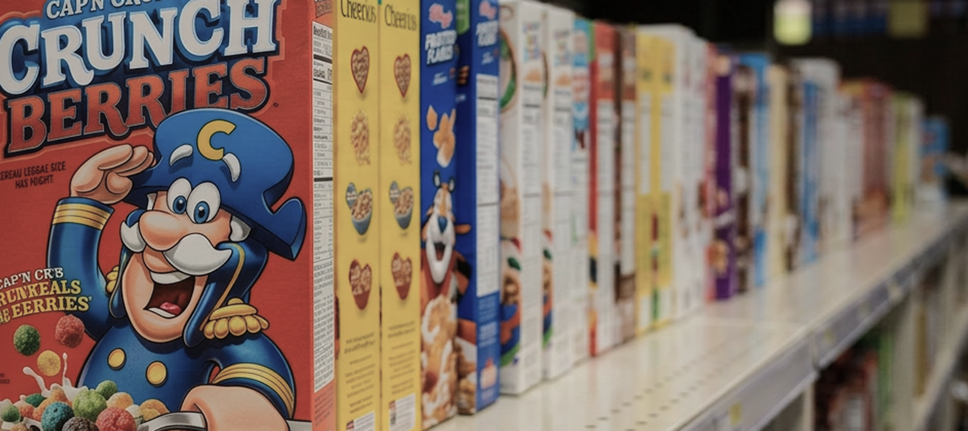
“Do you shop for cereal by looking at several boxes at once, or does the store manager hold up boxes right in your face?”
Hulu user, 2019
Beautiful app, but nobody could find anything.
Hulu had grown into a sprawling product — live TV, on-demand, originals, partner bundle — but the app experience hadn't kept pace. Users struggled to find content, switching between modes felt disjointed, and key actions were buried under layers of navigation. Subscriber churn was rising, and data insights showed deep frustration with the core browse and discovery experience.
⛔️ Organized for us, not for our viewers
The IA reflected our internal content structure, not how users actually think about finding something to watch.
⛔️ Cinematic but inaccessible
Thin fonts, washed-out gradients, and low contrast made the app hard to use. Unusual navigation pattern created user friction and made browsing became a lengthy process.
⛔️ Editorial team was stuck
The rigid design template system limited the ability to effectively run campaigns and experiments. The content strategy couldn't move at business speed.
Making the case
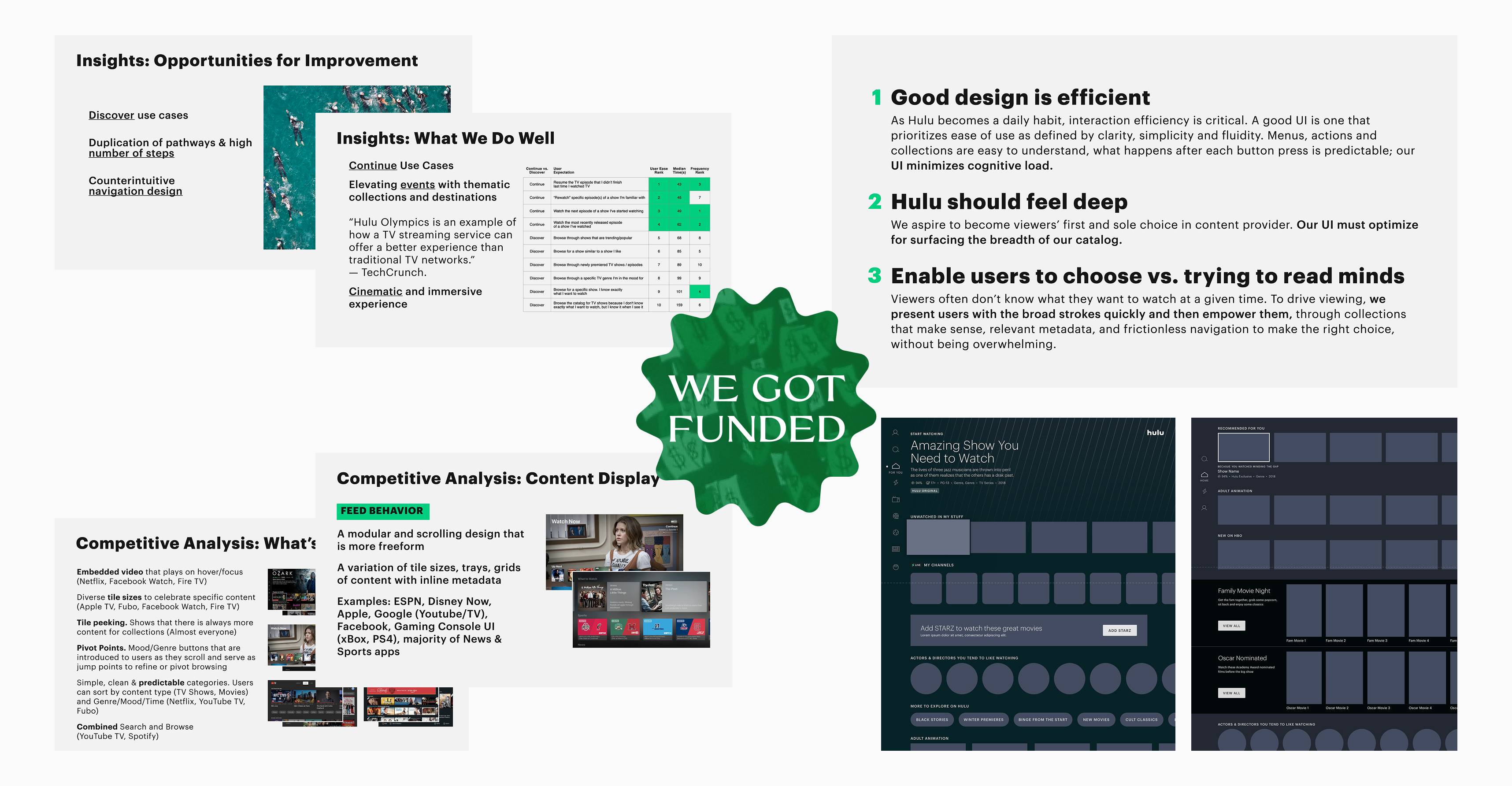
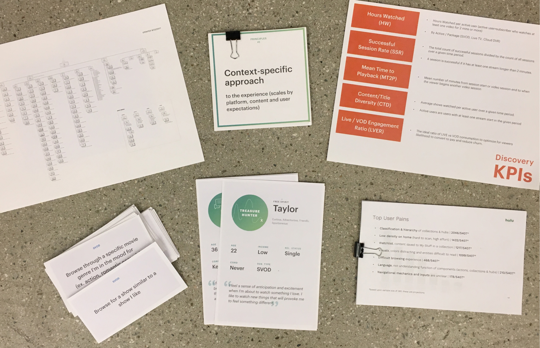
Before we did any design work, I partnered with product, research, and data to present to our CEO and senior executives to get the project funded. We had one month to prepare. My conviction: lo-fi wireframes only not polished UI, so that we could focus on discussing the problems and goals.
Bringing the brightest minds together
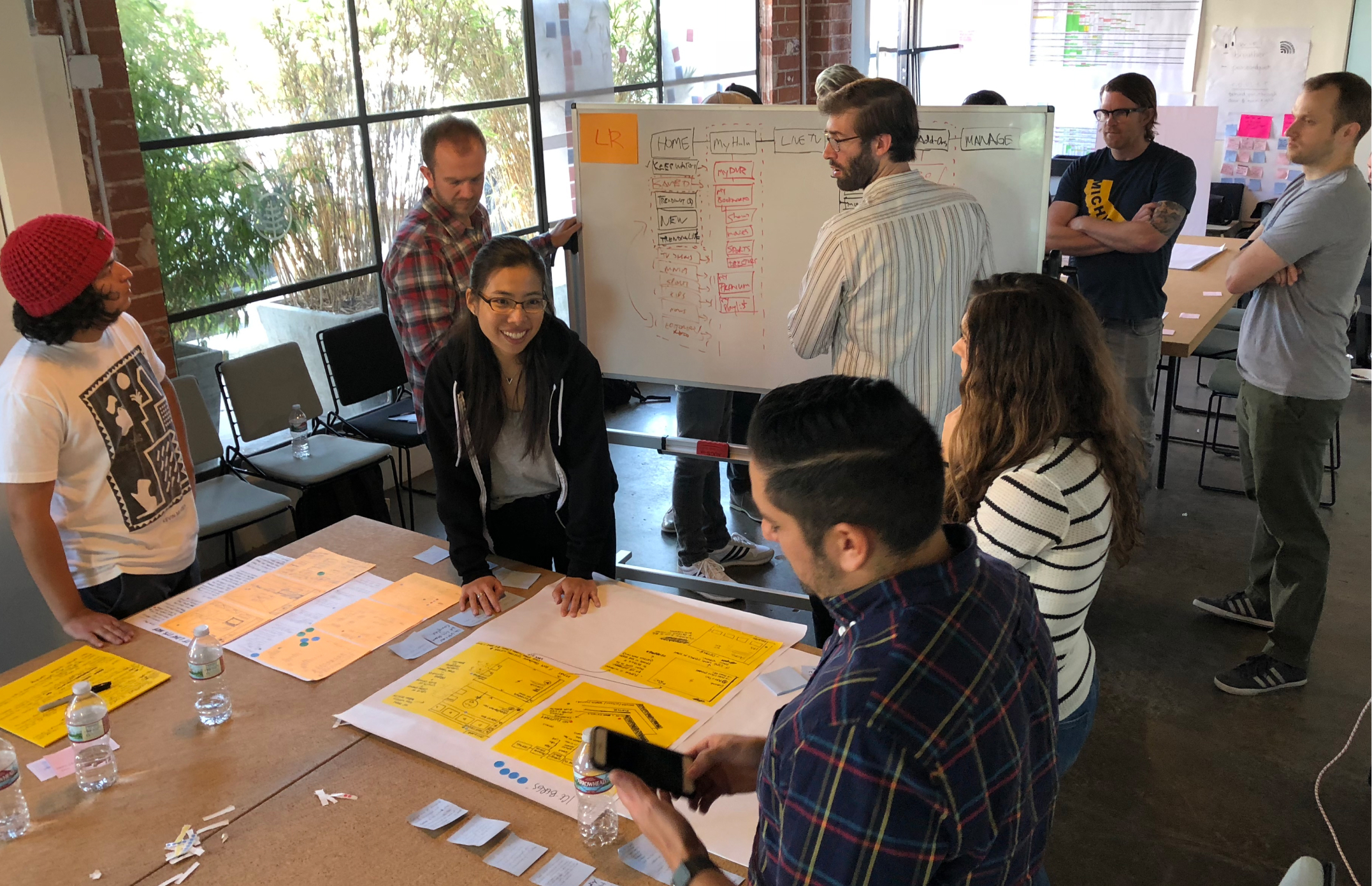
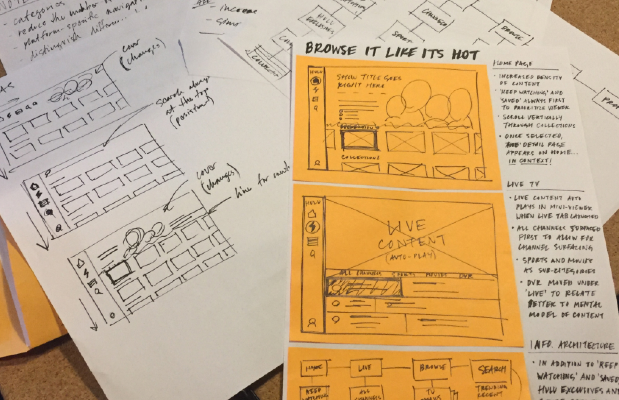
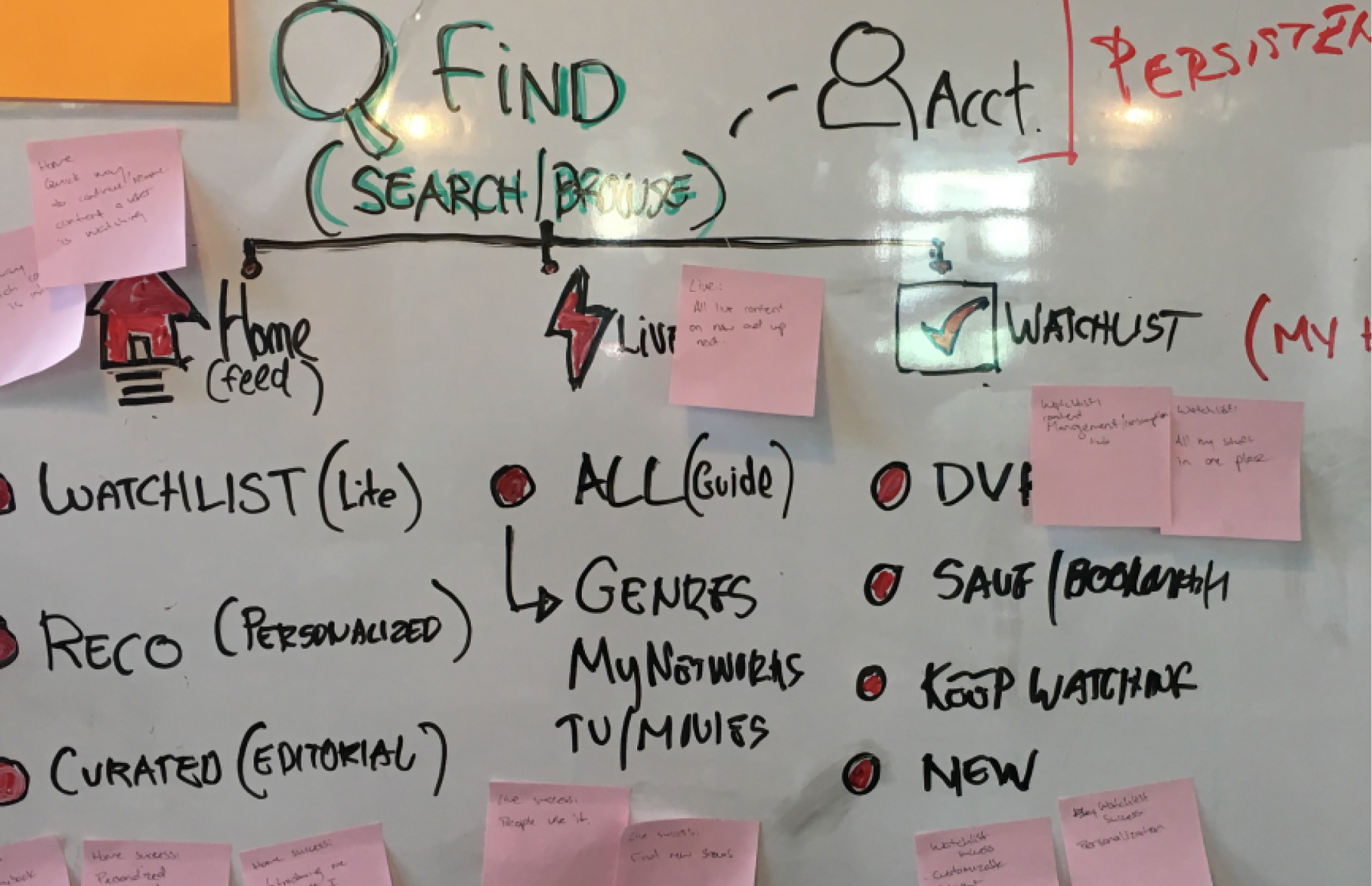
Redesigning navigation is a minefield and everyone has an opinion. I led a week-long IA sprint with 20 designers, product managers, engineers, researchers, and program managers. I didn't just want their input, I wanted them to be a part of building the solution together. With the workshop outputs, including IA structures, page layout sketches, and lo-fi prototypes., we narrowed down the ideas and created 3 directions to test with users.
Three systems rebuilt in parallel

Simplified IA

Accessible UX

Flexible Editorial System
Simplified IA

Move TV, Movies, and Sports to the main navigation and provide quick access to different content types.
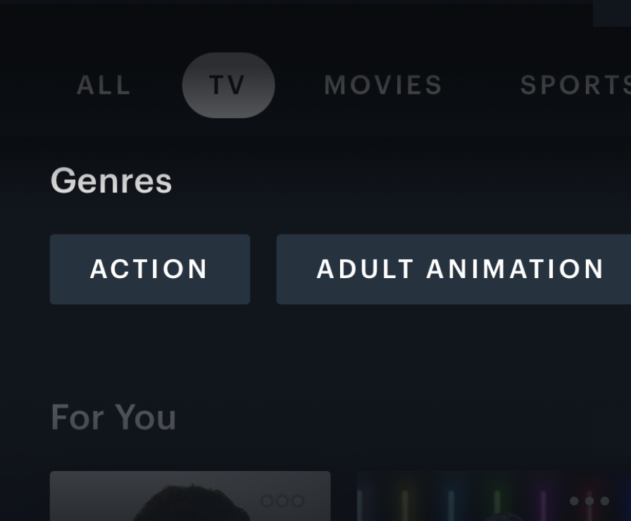
Introduce Network and Genre selectors for users to easily explore content based on moods and preferences.
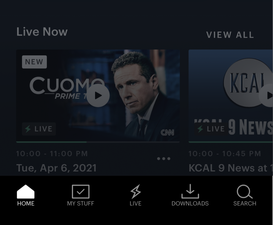
Remove Browse and display its content in Home to reduce the steps it takes to discover new content.
Accessible UX
We rebuilt the visual foundation from the ground up with higher contrast, thicker typeface, and a modular component system that could flex across content types and platform constraints. The experience is both cinematic and accessible. We also adopted an intuitive navigation and interaction pattern by utilizing content row and feed.
Flexible editorial system
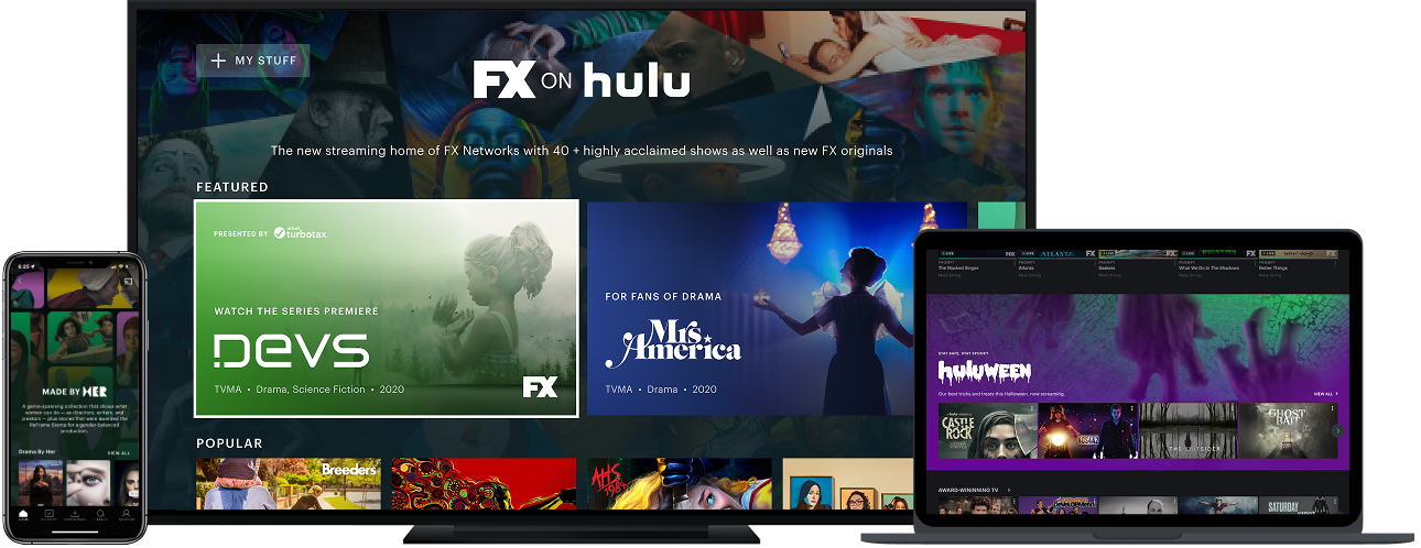
Established flexibility with 6 modular content components and 3 UI themes, so the editorial team could configure an expressive and cohensive campaign themselves without filing any engineering ticket.
Feedback and alignment at scale
In addition to gaining user feedback from our users to ship the right product, I encouraged my team to constantly find ways beyond design reviews for cross-team and others from the company to be actively involved in our creative process. When we launched the product, every team was invested in its success.
Built the rapid prototyping muscle
I presented to our CTO to secure 2 developers who built 30 production-ready prototypes in 4 weeks and conducted rapid testing in parallel.
Brought the whole company along
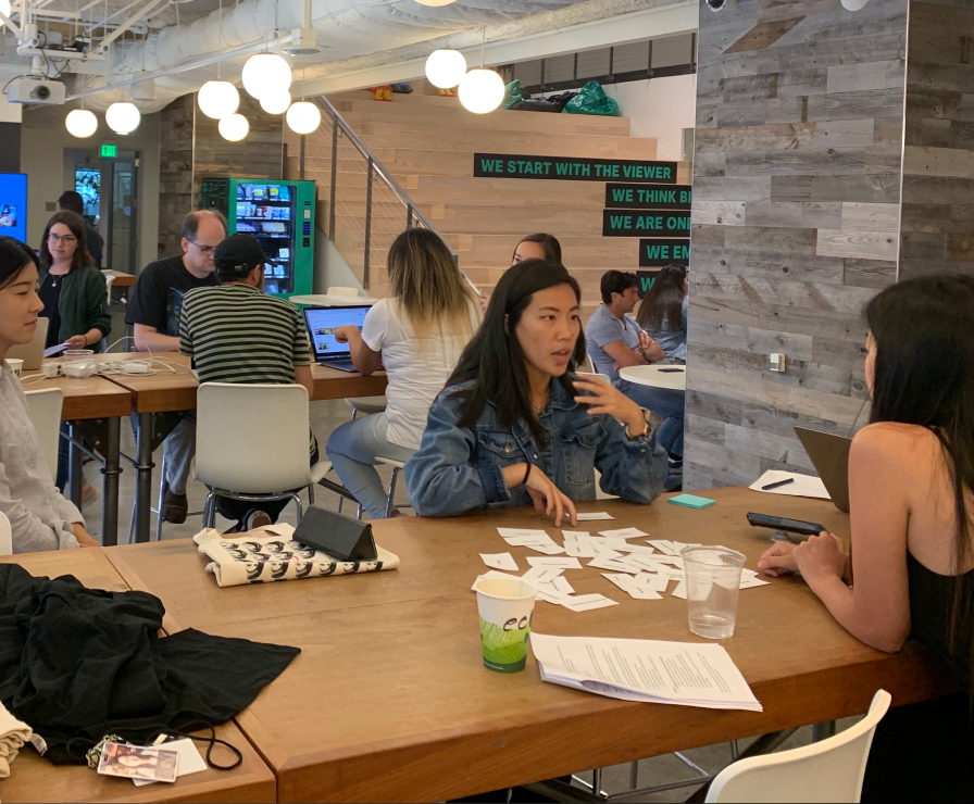
I guided my team to organize a series of company-wide design and research pop-ups to gather feedback and generate excitement.
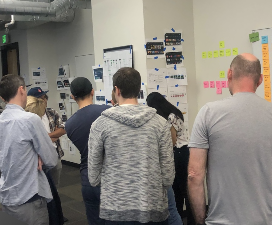
Rallied our partners
I organized a company roadshow with my PM and shared our design direction and strategy with over 16 teams across the company.
Product Demo

The impact
The redesign shipped to all 50M+ Hulu subscribers over a 6-month rollout. Results exceeded every target we set at project kickoff.
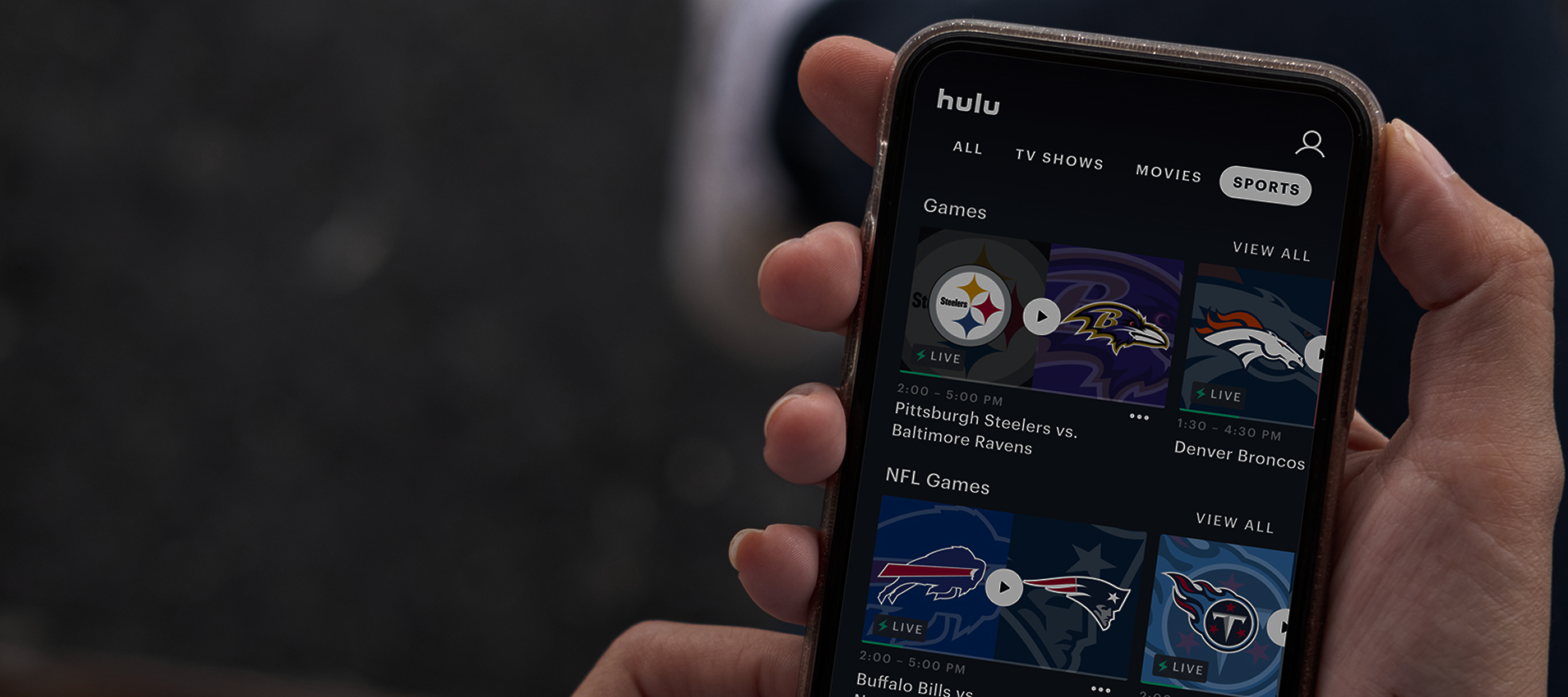
“Now that Hulu has a good layout and all the best shows, it's officially the best streaming service.”
@lilithsternin on X